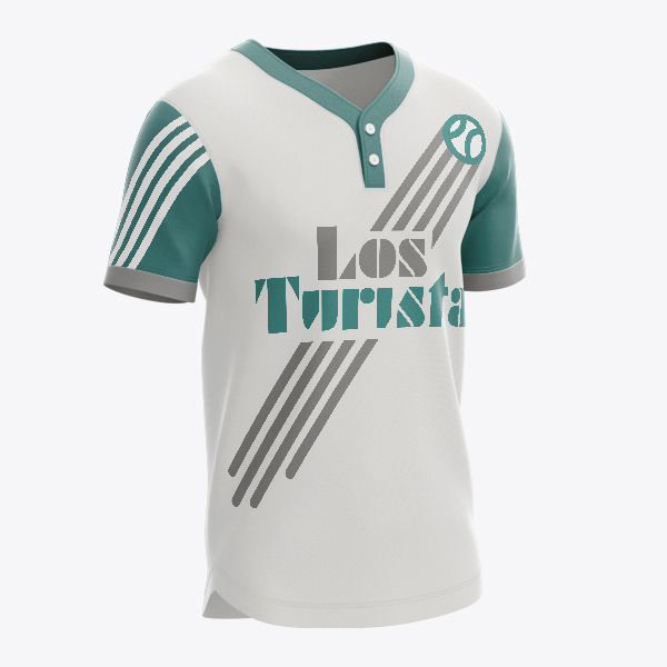
Los Turistas
Softball
Logo for a little league softball team composed of mostly Hispanic children.
I wanted to create a logo with a retro look. When I think of graphics from Mexico, I think of designs and illustrations from the 70’s. The geometric layouts, the colors, the flatness of the graphics.
I started with a fun retro font. Using the natural angles of the type, I created a softball graphic launching into the sky. I then cut out parts of the type to mimic the speed lines of the softball. This created a fun graphic focused on the excitement of the game. A dark green color was used to represent the grass on the field while sticking with a color palette that would fit with the retro look.