Wiedemann
Insurance
A logo for an insurance company located in Oklahoma City.
Insurance is an interesting business to design for. It’s a service you want but hope you’ll never have to use. If you’re calling your insurance agent, chances are something bad happened. Insurance companies also have a reputation for being hard to work with. How many people have a horror story working with an insurance company?
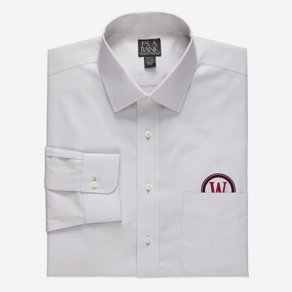
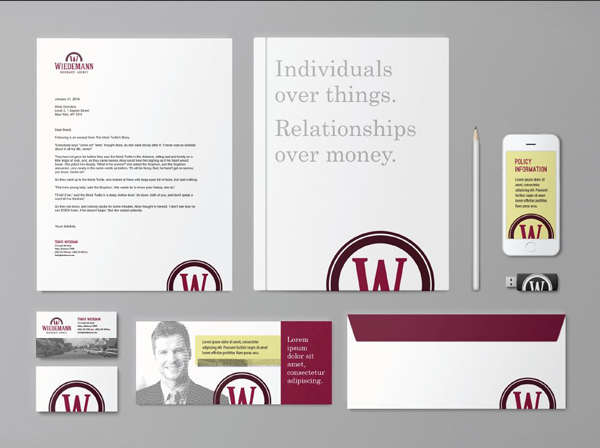
I had two goals for this logo. The first was to look professional. I used a nice serif font and a dark burgundy color to suggest a company that has been in business for a long time. It’s a logo that could have been created 20, 30, or 50 years ago. The second goal was to focus on the positive aspect of insurance. To do this, I created an icon of a partially cut off W inside a circle. This represents a sunrise peeking over the horizon. It communicates Wiedemann Insurance helping you have a better tomorrow.